
Designs for Week 03 of 2025 taking on the 100 Days of Graphic Design Challenge.
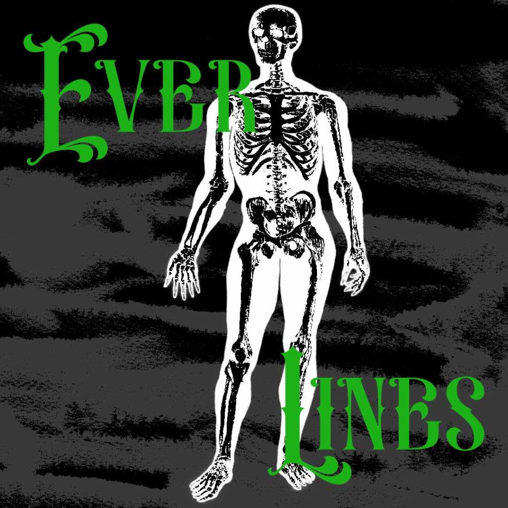
Day 43
For this piece, I used the Everlines font. I didn’t really know what to do for the text, so I just used the font name. Honestly, that’s what I’m going to do in the future.
Now, I did have a bit of a hard time trying to figure out what to do for the image. In my resources, I had this vintage illustration from 1900 that I got from rawpixel’s collection of public domain images.
I didn’t really know what to do with the image, so I inverted the color and added a texture in the back to give it a misty look. Not sure if I represented Everlines well as a font, though. Will need to do that in the future.
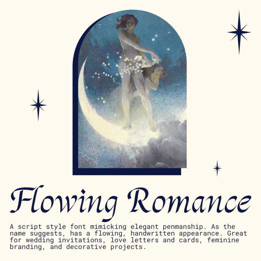
Day 44
I started this project using the Flowing Romance font, and the text is based on what that font is best used for. It’s a nice font that I can see using in the future for other projects.
For the image, I used Spring Scattering Stars (1927) by Edwin Blashfield. I really, really liked the illustration, so I knew I had to create a graphic out of it. I was thinking of making some kind of flyer of the image, and maybe that is something I will do in the future.
Anyway, today’s project was really fun. It was really, really fun.
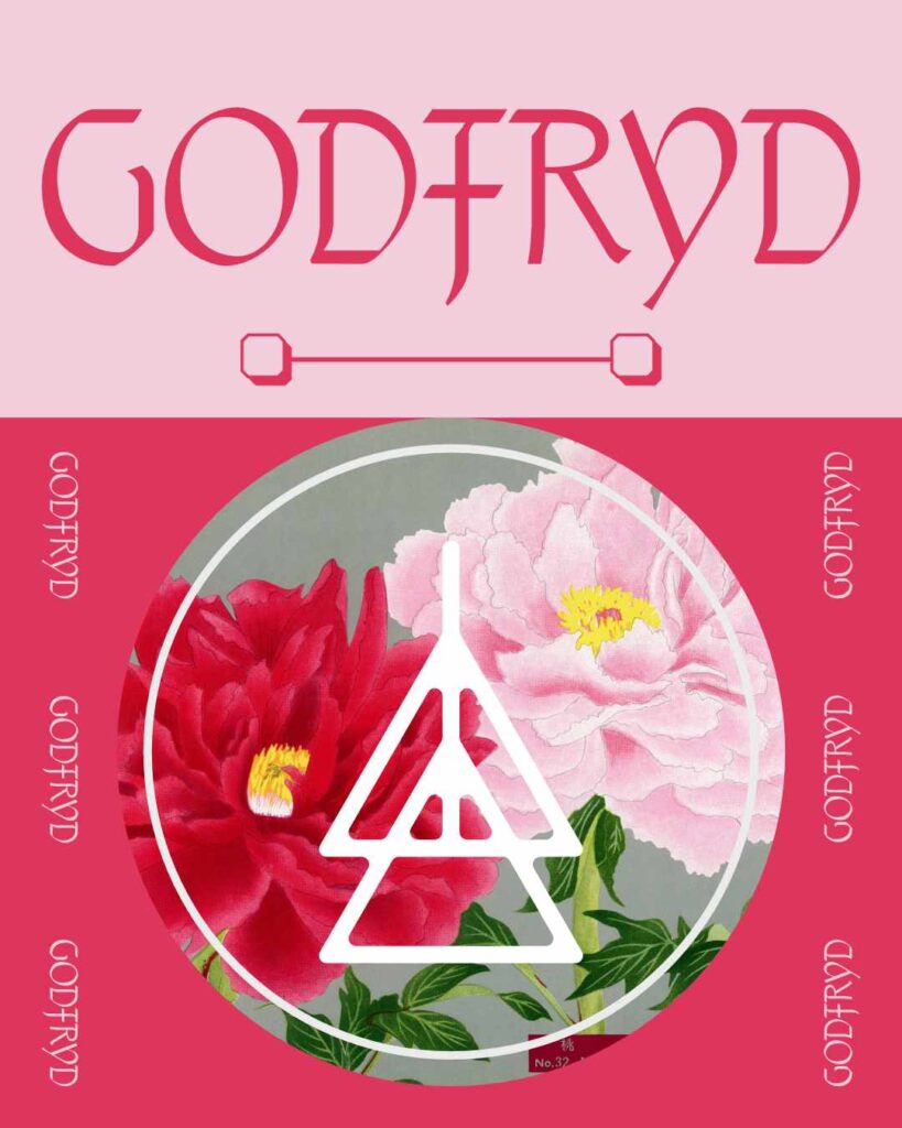
Day 45
I had a lot of fun with this one. A lot of fun! Before I did anything, I tried to get some inspiration for today’s challenge. I follow foxrocketstudio and came across some of his designs that look like really cool bookmarks. Check out his Insta to see what I mean.
Then, I used the Godfryd font and used the name of the font as text in the design. The colors of the piece were heavily influenced by the illustration of peonies I found on in the public domain. And I think that is what made this piece pleasing to the eye.
Overall, I had a lot of fun here. I’m satisfied with what I managed to create.
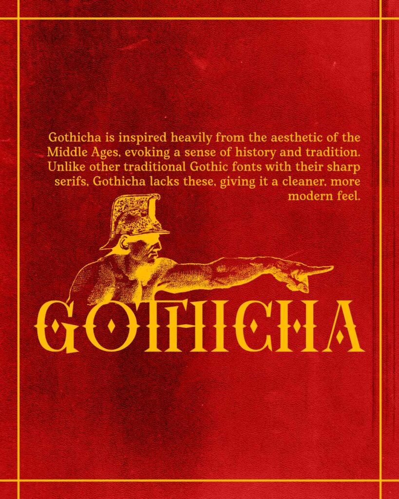
Day 46
With today’s design, I had a lot of fun with this one. I used the Gothicha font for the large text and then Bittyfish for the small text. When thinking about what image I could pair with the main font, I wanted to use something medieval.
The illustration I chose is a vintage illustration on a transparent background that rawpixel offers as a free illustration. I thought it fit well with the Gothicha font. Then, I used a texture from a texture pack I bought from PixelSurplus.
For the colors, I just went with colors that complement each other and I enjoy using in my work.
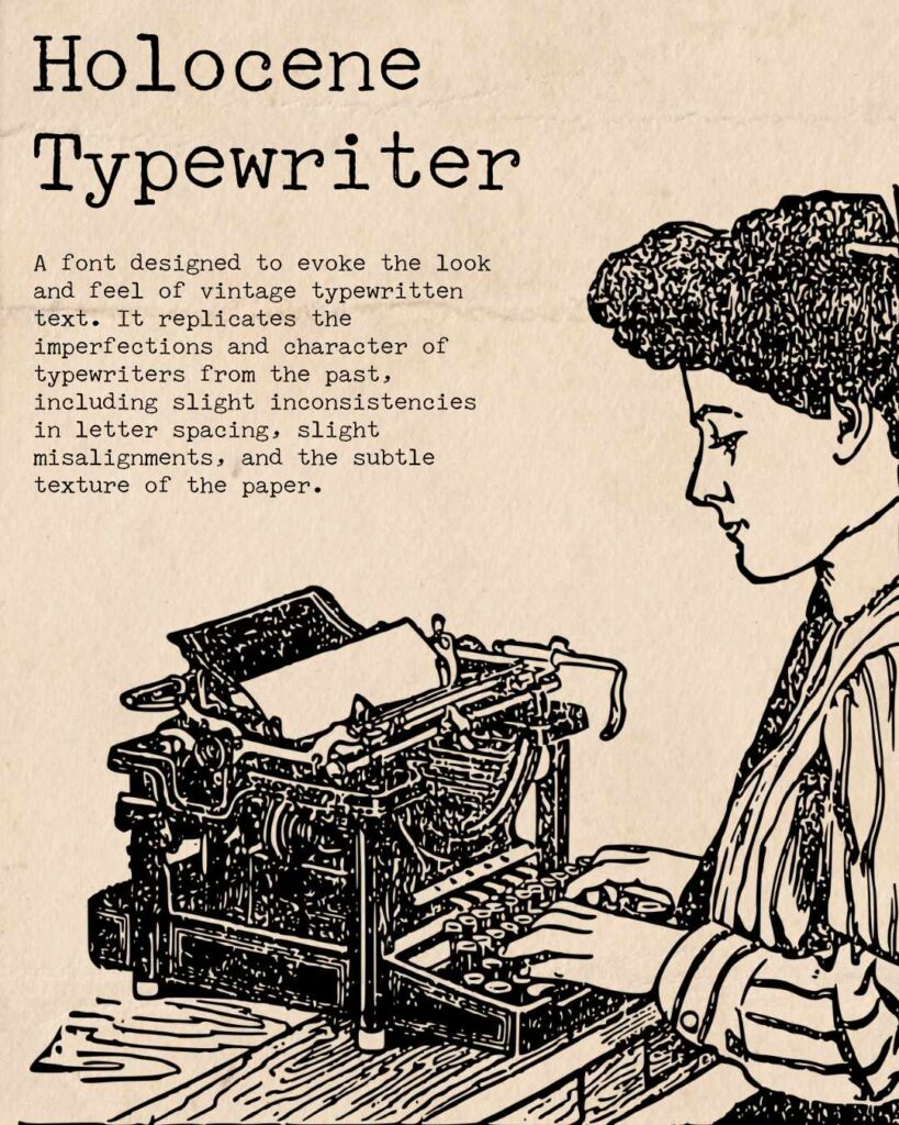
Day 47
For Day 47, I selected the Holocene Typewriter font from the large collection of fonts I have accumulated in the past few years. It’s a nice font to use in projects that call for a retro feel. The font inspired me to then look at images that have a typewriter. I found this image from rawpixel that I liked and decided to use it along with the font. To me, it is a great pairing.
To add something to the image, I placed a paper texture typewriters often used on the image. It was all I needed to get the aesthetic that I wanted. It was a lot of fun. A lot of fun.
Day 48
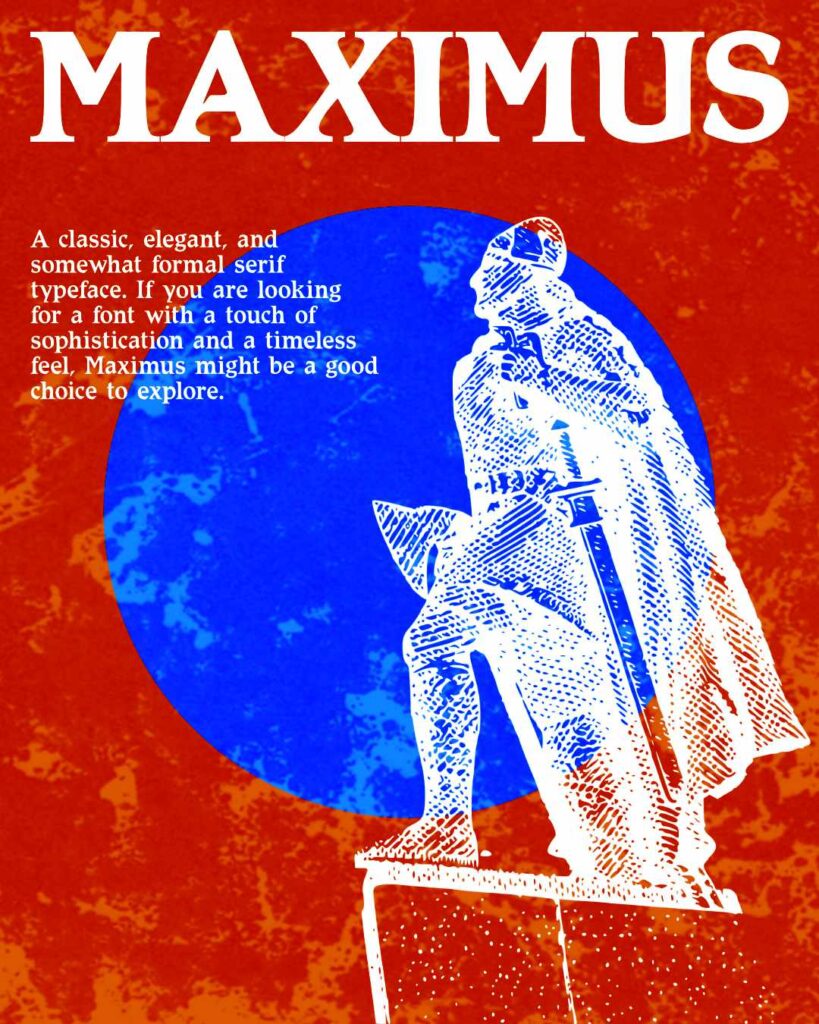
For this project, I used the Maximus typeface for the headline and text. It’s a nice typeface that I can use in the future.
Next, when selecting an image, I chose this vintage illustration of Leif Erikson from the free category. It was perfect to pair up with the Maximus typeface.
To add a little something to the overall image I slapped on a texture and set it to an overlay. That really got the image to pop for me.
Overall, another piece that I ended up being satisfied with. Could I have done more? Of course! But I’m trying to learn and not be a perfectionist. The goal of the 100 days challenge for me is to learn just a little bit, every day. And I think I am achieving that very goal. Onwards to Day 49.
Day 49
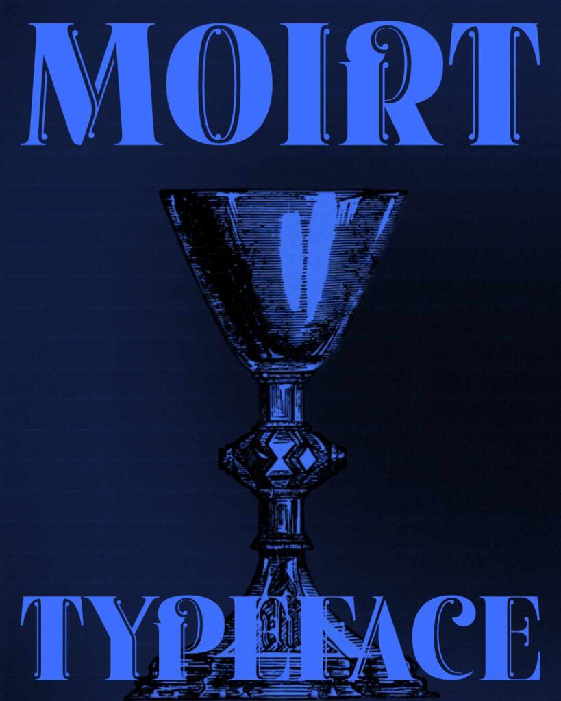
For this design, I started with selecting the Moirt typeface. It’s a nice serif display typeface. Since Moirt is a serif display typeface, it made sense to just use the name as the text because of bold Moirt is.
As for the image, I found it on rawpixel (old reliable). I wanted something that was fancy but archaic. I thought this chalice was perfect for that. It worked well with the Moirt typeface.
After that, I used a scan texture to finish the design. Add a little something, something. In the end, I really like the result.
Leave a Reply