
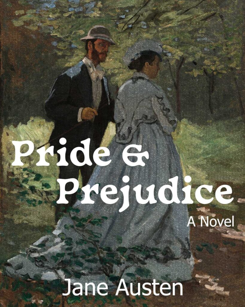
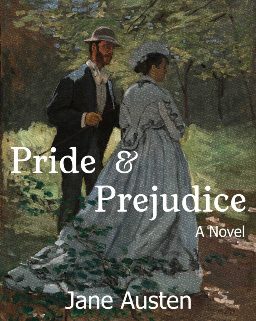
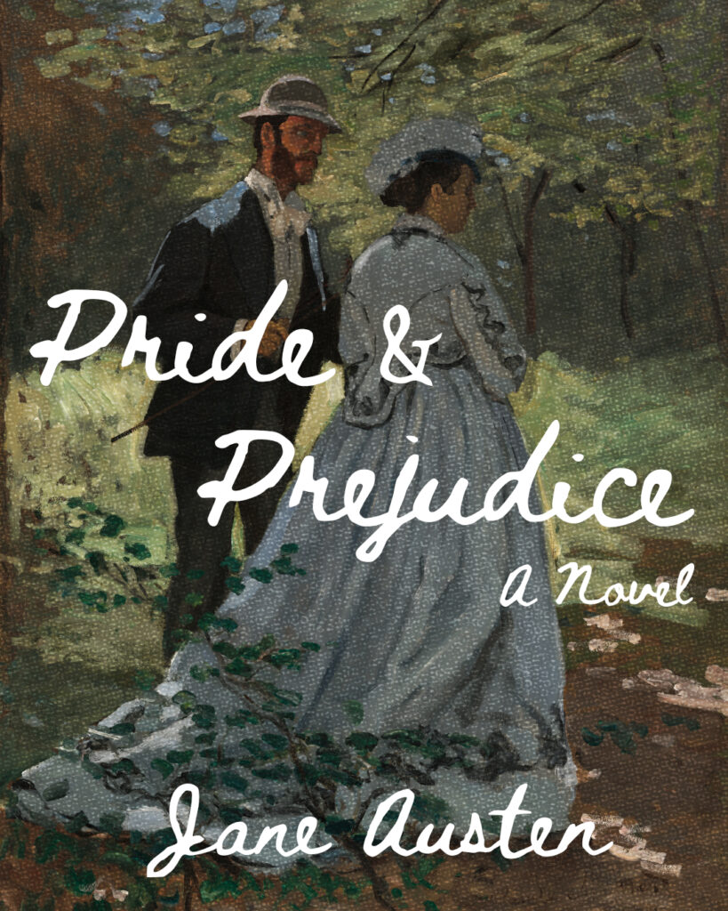
For Design #119, I wanted to create a cover for Pride and Prejudice. I wasn’t too sure if I wanted to go with a minimalist design or what. But when I saw Claude Monet’s painting while looking for inspiration, I knew I had to use the image for the cover.
The next step was to figure out the font I wanted to use. The one I ended up liking the most is Beth Ellen 2, the font you see in the third image.
Typeface: Basteleur, Tahoma in the first image; Bittyfish, Tahoma in the second image; Beth Ellen 2 in the third image
Image source: Claude Monet’s Bazille and Camille (Study for “Déjeuner sur l’Herbe”) (1865)
Leave a Reply