
Designs for Week 02 of 2025 taking on the 100 Days of Graphic Design Challenge.
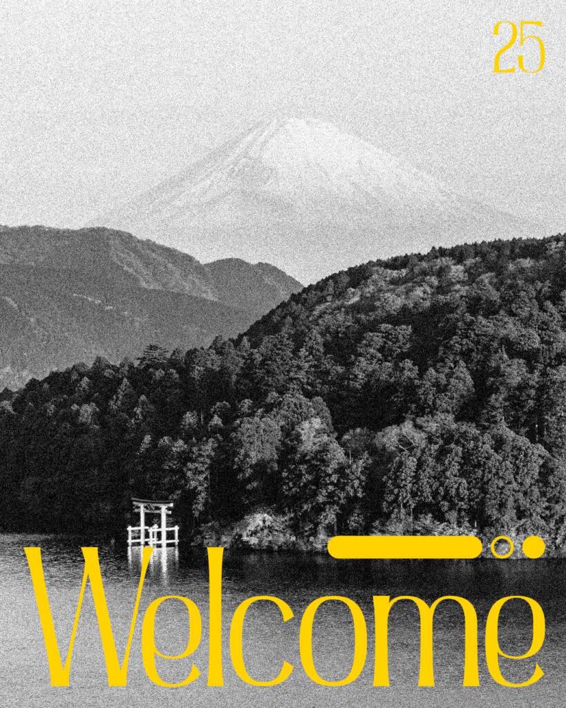
Day 29
Image: Photo by Jochen Meyer
Typeface: Admercia
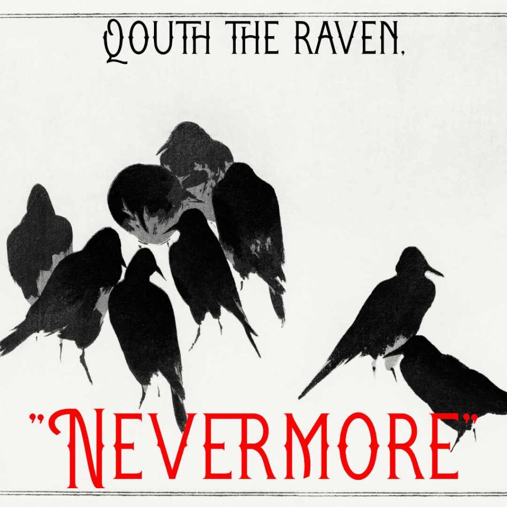
Day 30
I dug into some public domain art via Rawpixel for inspiration and found this amazing illustration by Wantanabe Seitei. And even though the illustration depicts crows I used a classic Edgar Allen Poe quote from his poem The Raven. For the font, I used the Architoria typeface.
Image: Japanese crows
Typeface: Architoria

Day 31
I started this piece selecting the Astragon font. Then, I searched through the public domain on rawpixel until I found something that I liked. This beautiful illustration by Thomas Baxter caught my eye so I decided to use it in the end project. Then, I messed around with colors until I found something I liked.
Image: Illustration by Thomas Baxter
Typeface: Astragon
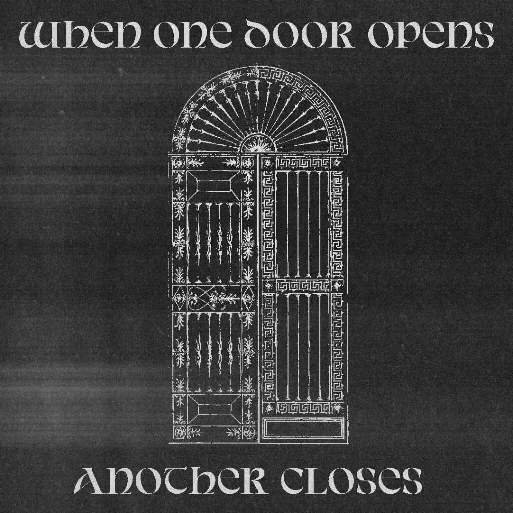
Day 32
For this piece, the first thing I did was select the Avendica font and looked for an image that could pair well with it.
I browsed the public domain section on rawpixel (again) and looked for anything that caught my eye. I eventually found this piece called the Alternative Designs for a Metal Gate from The Smithsonian. I decided to use it as the main illustration.
But I wanted to add something else and decided to use a texture. That really transformed the design, and now you see the end result.
Image: Photo from rawpixel
Typeface: Avendica
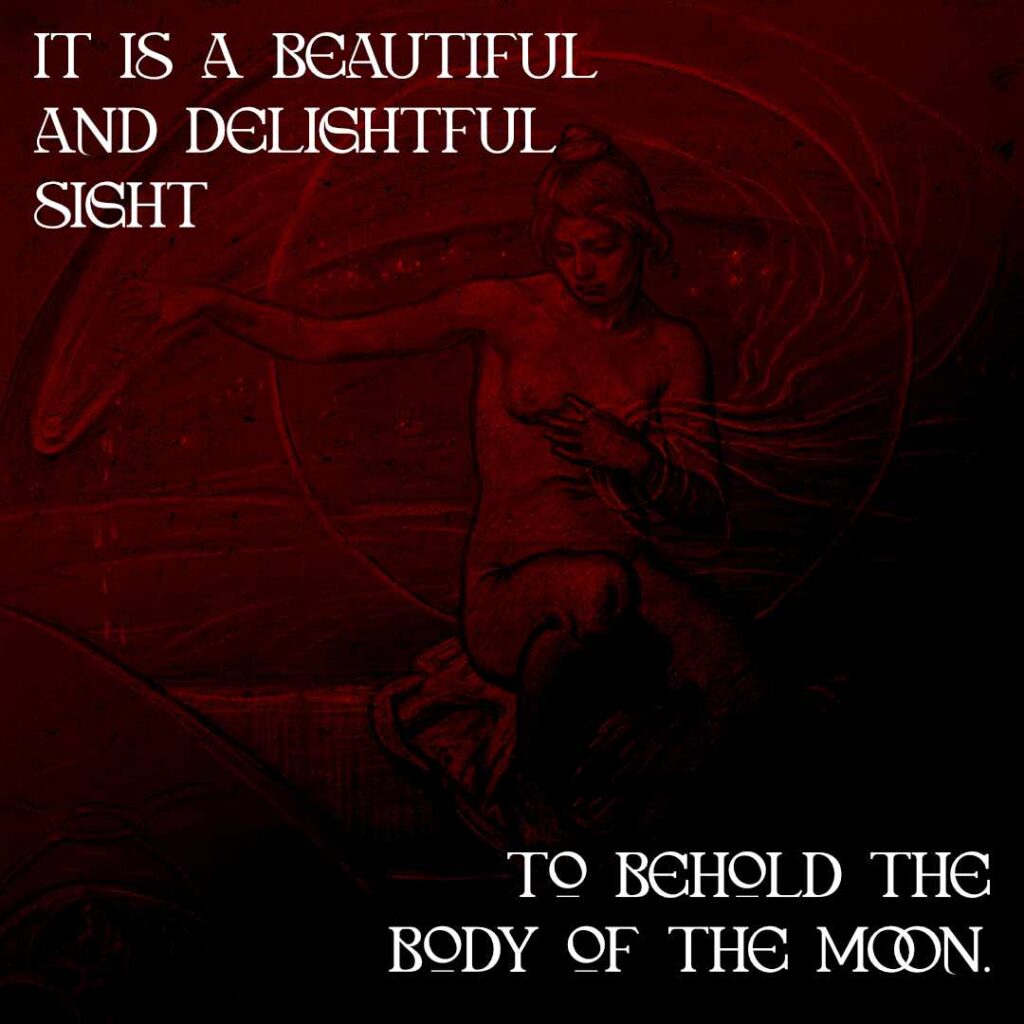
Day 33
The font used in this design is besage. I chose this particular font because it was next on the long list of fonts that I have yet to use. It’s honestly a great font that could be used for fantastical elements.
The quote I used is attributed to Galileo Galilei.
The illustration I used in this design in called “Study for Stella Funesta (The Evil Star)” by Elihu Vedder.
I played around with some filters and colors to finally get the end result that you see here.
Overall, I really like how this piece turned out. It’s dark and foreboding.
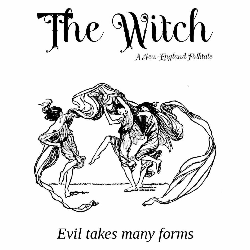
Day 34
For today’s piece, next on the list of type to use was the Blackmoon font. I used it for the title and subtitle. But for the bottom text I used Liberation Serif font. I wanted it to be a different from the title and subtitle.
The illustration used was taken from the Public Domain Image Archive. I wanted something that fit the script-like nature of the Blackmoon font, and eventually found this image of women dancing in a circle.
I recently watched The Witch by Robert Eggers, and the illustration of women dancing gave me the inspiration to make a simple graphic for the movie. Nothing fancy. Just a theme to stick to.
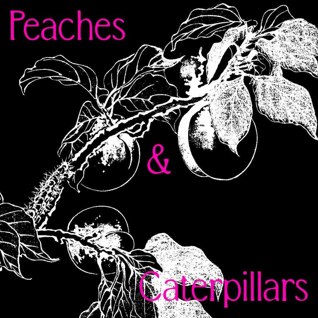
Day 35
For this piece, I started with using the Bornean Blur font. Then, I once again selected a photo from the public domain via rawpixel. I really love this particular illustration because of the artistic rendition of peaches and a caterpillar crawling up the branches.
The illustration was so good I didn’t really want to do much to transform the image, but design is about doing just that to communicate a message. And that is something that I need to do a better job with moving forward.
I shouldn’t be so hard on myself though because the turn around on a 100-Day Challenge is insane. I don’t think I can keep on doing this past 100 days because of my full-time job and other responsibilities.
But the challenge is fun and I can’t wait to continue to see this project through.
Leave a Reply