
Designs for Week 02 of 2025 taking on the 100 Days of Graphic Design Challenge.

Day 36
For this piece, I used the Boundhero for the type, and colors that I use my brand. Then, I wanted to use some shapes that draw the eyes to the type. I might have been too much, and that is something that I want to be more cognizant of in the future.
Day 37
For today’s project, I started with picking the Brisora font. Then, I perused the Public Domain to find something that would fit the font style. When I saw the Woman holding cats illustration by Edward Penfield, I knew I found the image that I wanted to use.
I brainstormed what this font and image to communicate to the viewer. A design for a cat food ad came to mind, so I decided to go with that. I played around with shapes and eventually came to the final design.
I think next time I will try to record my process, but we shall see how much that adds to my plate.

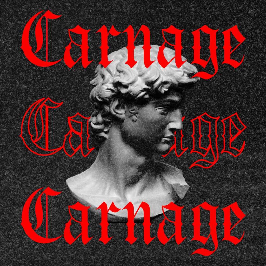
Day 38
With this project, I started off by selecting the Carnage font. I really, really like this font. It’s something that I’m going to use a lot outside the 100-Days of Graphic Design challenge. I even used the name of the font as the text within the project.
As for the image, I once again delved into the Public Domain and found an image of the head of the statue David by Michelangelo Buonarroti. I thought it would pair up well with the Carnage font.
After that, I used a texture and overlaid it over the whole image. I really like how this one turned out.
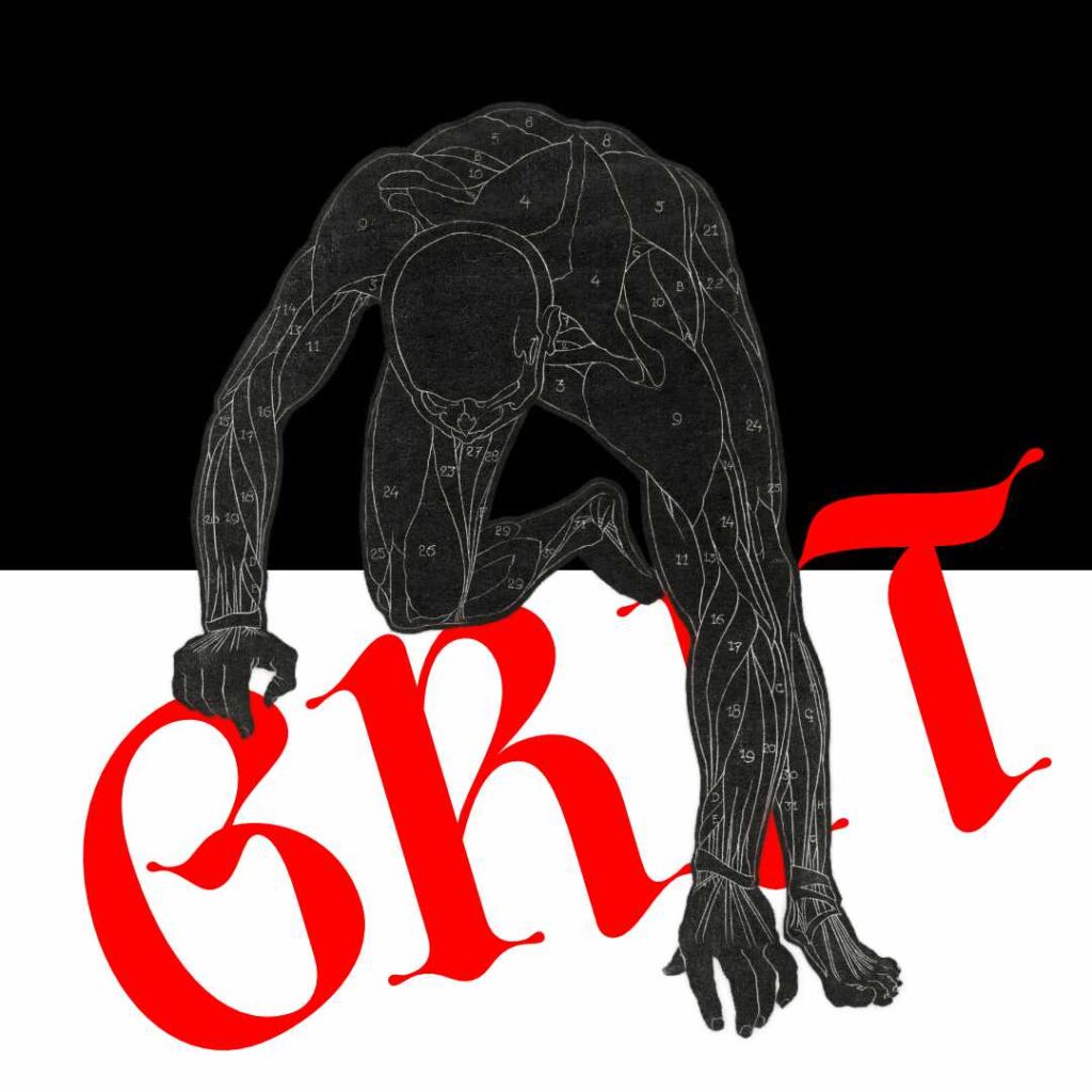
Day 39
The font that I used today is Diences, another font that I really like. Then, I pulled from my stash of Public Domain images, something that I thought I could something out of. The anatomical study of a man’s neck, arm, and leg muscles in silhouette by Reijer Stolk seemed to be a perfect fit for what I was trying to achieve.
Since the image looks like a man picking himself up, I thought I could work with that concept. I moved things around and settled on the final image, as can be seen here. Another project that I liked the final product of.
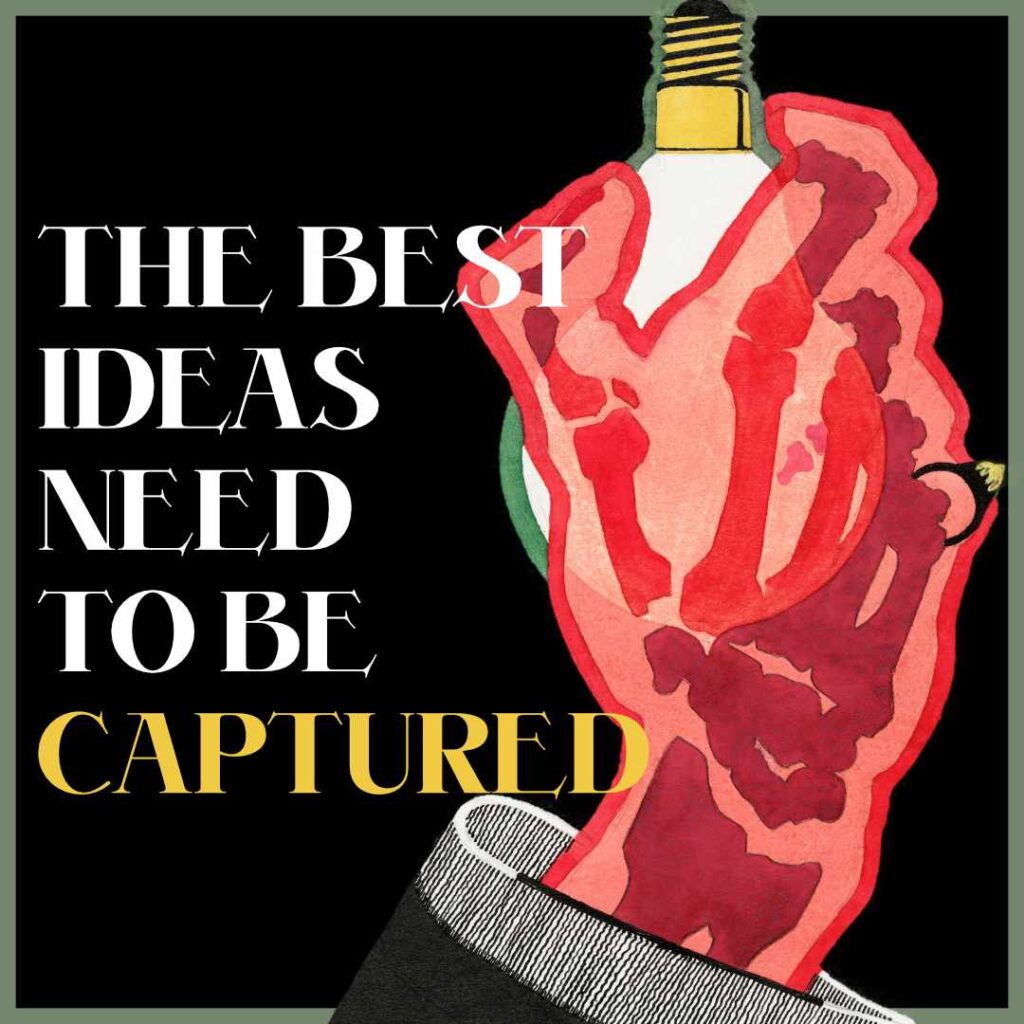
Day 40
For Day 40, I selected the ED Alben font for my text. The font is a nice font for displaying headlines and titles, and certainly a font to keep in mind when I try my hand at book design covers. Since I also write, I know this font will be a great tool in my toolbox in the future.
Now, the image I selected was part of an old ad for Lamps by Reijer Stolk. I isolated the image of the hand and lightbulb, and re-added some elements from the old ad to the graphic I created.
Overall, I liked how this graphic turned out. I thought this challenge would be a slog, but as I continue to create, every day, I’m having a lot of fun even when I feel like I have ideas.
Day 41
I tried something a little different today. I wanted to use the perspective tool in Affinity Photo 2 and messed around with it. I went through multiple versions for this piece, and nothing I created really felt right. In hindsight, I should have documented the different versions, and that’s something to think about in the future.
For the font, I used the ED Muskrat font for the quote and Roboto for the smaller text.
Overall, I didn’t really like the end result. But I ran out, time I have allotted to myself to work on the 100 Days challenge every day. Ah, oh well. Better luck next time.
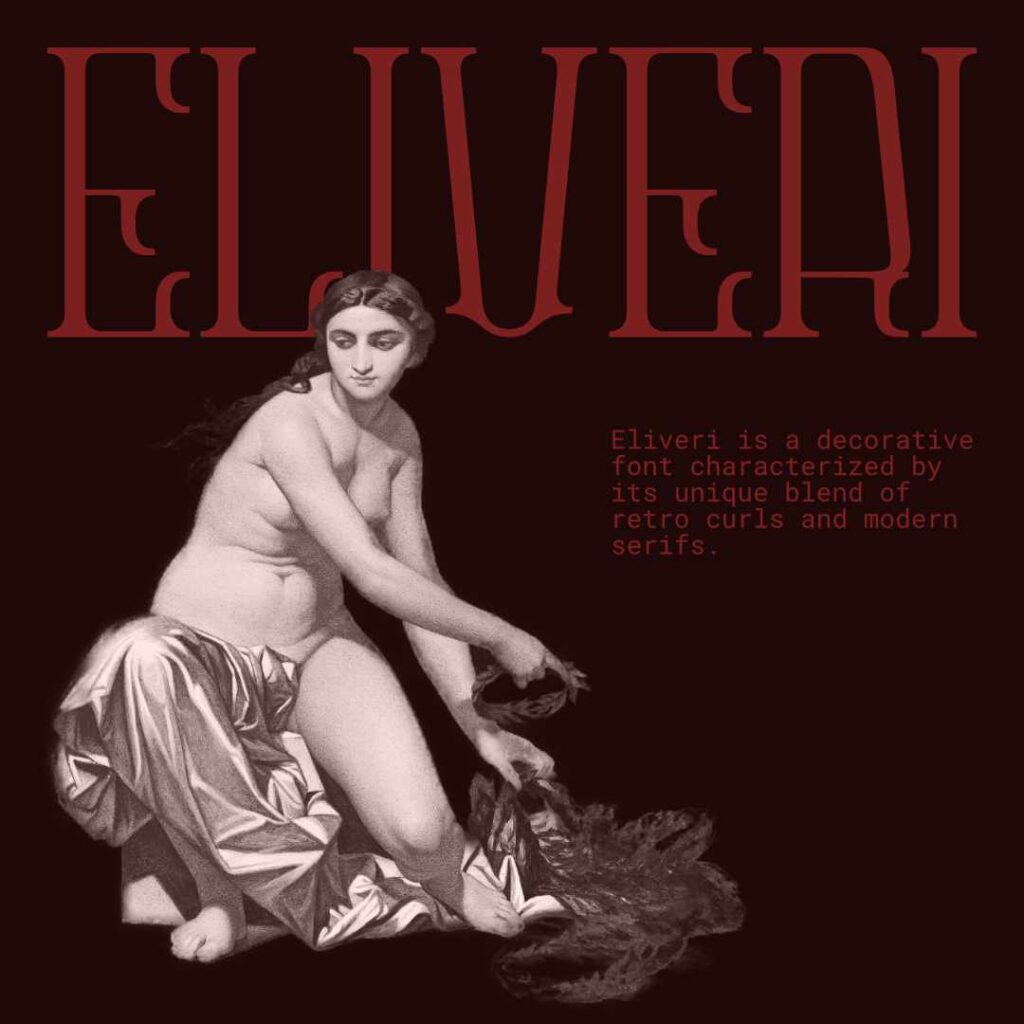
Day 42
I had a lot of fun working on today’s project. And this time, I recorded my process! That is something I will post once I clean up the video. Learning video editing definitely wasn’t on my list of things I would do, but I realized it would provide a lot of value for people who want to know how I did something. A quick video to create a visual for my words.
I started this piece off with selecting the Eliveri font. And then I figured I could showcase it off a bit and write up what makes Eliveri an interesting font to use.
The image I selected for this piece is a study for a figure of Fame, from the Hémicycle des Beaux: Arts, École des Beaux: Arts (1837–1841) by Paul Delaroche. I thought the image fit the font well.
Overall, I really like this piece.
Leave a Reply