
Designs for Week 03 of 2025 taking on the 100 Days of Graphic Design Challenge.

Day 50
For Day 50, as usual, I started the project by selecting a font from my bag of fonts. Obituary is the name of the typeface that I chose for Day 50. I like typefaces where the edges are sharp and archaic-looking. Naturally, I added this font to my favorites.
For the image I used in the center of the design, I once again reached into the bag of images I have collected from rawpixel. The Venus statue is an image I will use in future projects because of how iconic of an image it is.
I’m sure there is more that I could have done — other directions I could have taken the design, but I am happy with the overall result. I am halfway through the challenge and not losing steam.
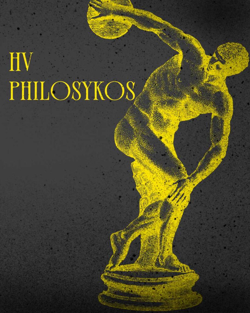
Day 51
For Day 51, I started off with picking the HV Philosykos typeface. Another nice font I would use if I wanted to go for an elegant feel. I’m sure I could have done a better job utilizing the font. I’m going to keep that in mind for a future project.
Now, I used an illustration of a discus athlete for the main image because I wanted to bring out the classical feel of HV Philosykos. I could have done a better job, but I ran out of time. That’s alright.
Next time, I want to try to design an ad. Something I can communicate my ideas through.

Day 52
The typeface I used for Day 52 is called Reina Sofia. It’s an elegant font I can see being used for brands that want to give off a sophisticated air. I tried to capture that air as much as I could.
The image I used is a rawpixel free image. Honestly, rawpixel is such a great resource, I highly recommend it to any graphic designer who needs images to work with. There are many images like this in their library.
Another successful day, working on my design skills. 48 days to go.
Day 53
Day 53 was a lot of fun to work on. A lot of fun.
I started off with picking the Rigel typeface. I love the angularity of this type, and thought about what images I could use to pair with it.
I found a PNG of Michelangelo’s David from rawpixel and selected a diagram image from Massive Supply Co’s Diagrams 2 pack. Then, to add some pizazz, I set a noise filter to the whole image.
I’m happy with what I ended up with.

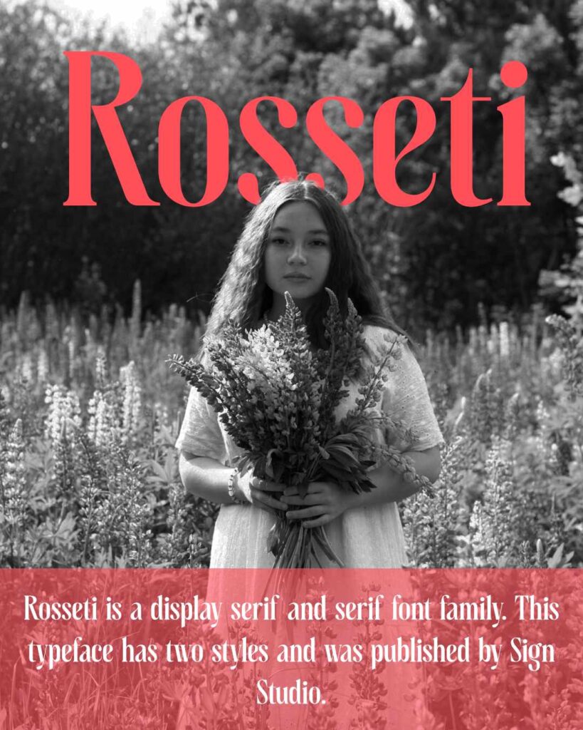
Day 54
For Day 54 I started the project with the selection of Rosseti. It’s a nice font from Font Spring.
Then, I wanted to do something different with the graphics. For the image I used here, I got it from pexels. Then, I tried to stylize the image in a way that minds the viewer as a magazine cover.
I could have done better. And maybe that is something I will work on in the future. I eventually want to create book covers — or covers in general.
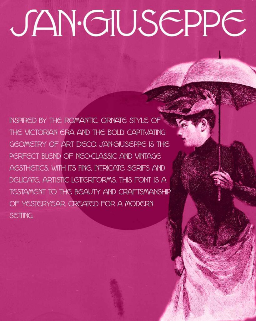
Day 55
For Day 55, I started with selecting the San Giuseppe typeface. Another elegant typeface that can be used to create an air of sophistication.
For the base image, I grabbed a Public Domain image and put a pink fill layer over it. I also added an old film texture to give it an older look. The rest is history.
I’m not in love with the end result. I’m not happy with everything. But, for today, I think it will do.
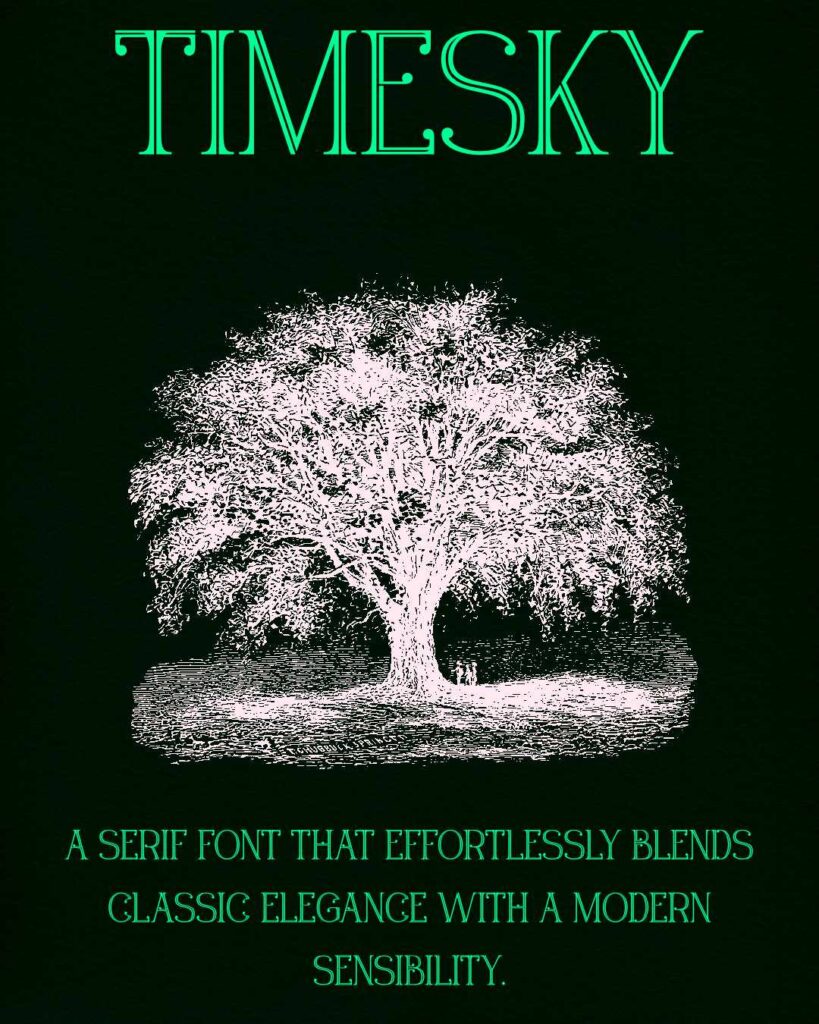
Day 56
For Day 56 I started with selecting the Timesky typeface.
Then I selected a vintage illustration of a tree from the Public Domain.
I played around with the colors that I wanted to use and eventually came to a dark green and a light green — so light, it’s almost blue.
Then, I used a paper texture to finish the look.
Leave a Reply