
Designs for Week 04 of 2025 taking on the 100 Days of Graphic Design Challenge.
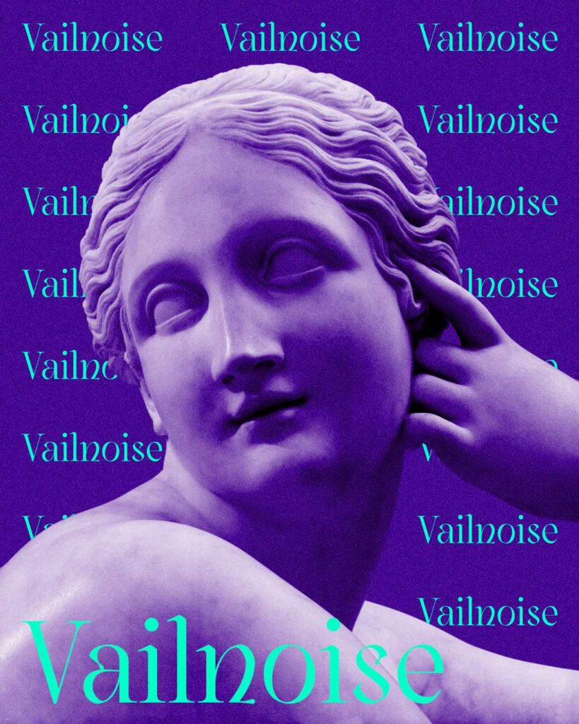
Day 57
For Day 57, I had a lot of fun with this project. A lot of fun. Vailnoise is a font I plan to use in the future because I like it a lot. The colors I used in this project are colors that I definitely want to use in the future.
I used this image from rawpixel.
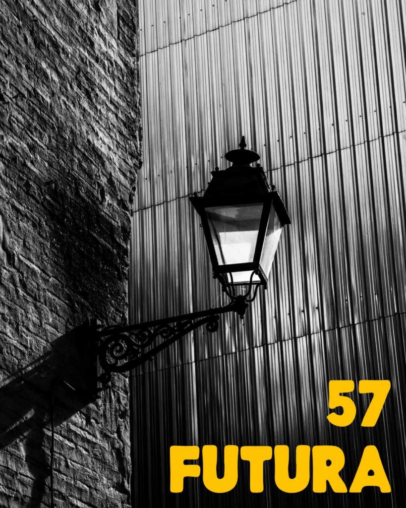
Day 58
I found this great image from Pexels, and thought I could evoke a vintage feel.
I changed the photo to black and white.
Then, I used the 57 Futura font by Jason Forest to pair up with the image. Since I made the image black and white, a bright color like yellow enhancing aspects of the font.
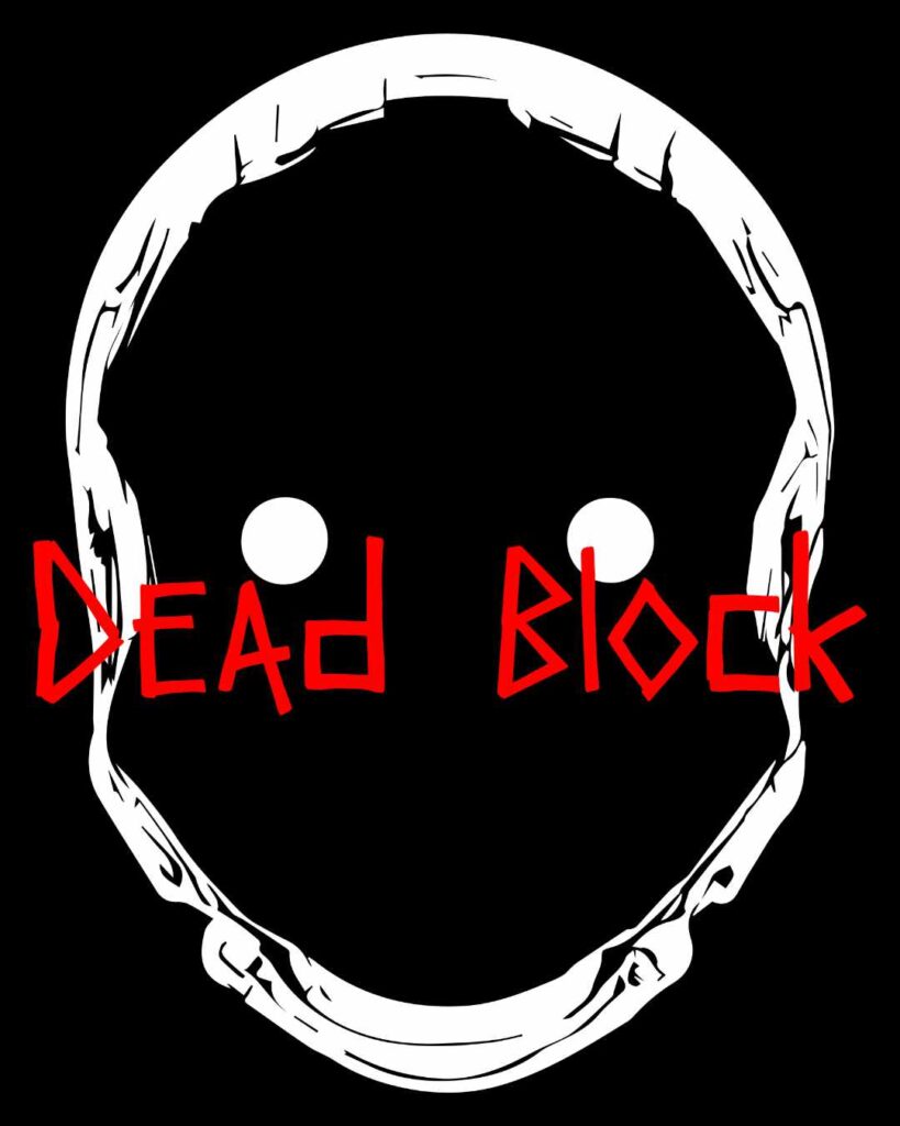
Day 59
When I picked the Dead Block font, I knew I had to do something sinister.
I decided to use a vector from the Cyborg Vector pack from Fox Rocket Studio. Played around with the colors and got the following.
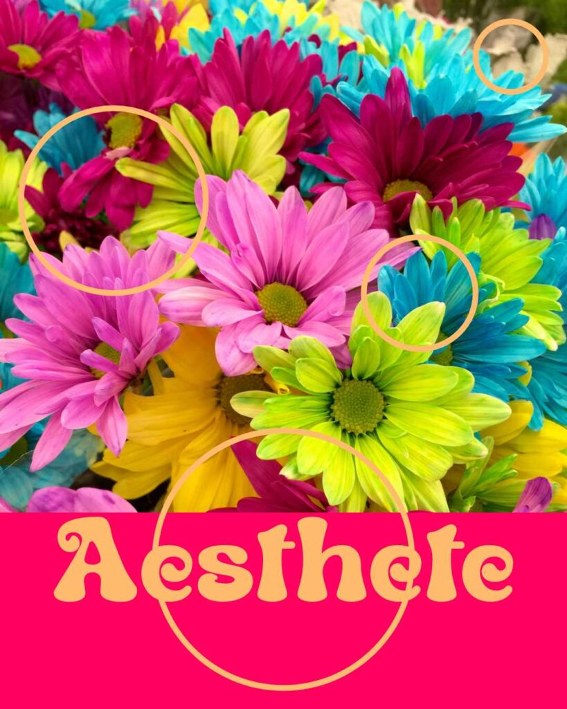
Day 60
The font I used for Day 60 is Aesthete. It gave me a 70s kind of feel, so I went with flowers and some circles and lighter colors.
For the flower background image, I used a photo by Unchalee Srirugsar from Pexels. I thought it fit well with what I was trying to achieve.
Day 61
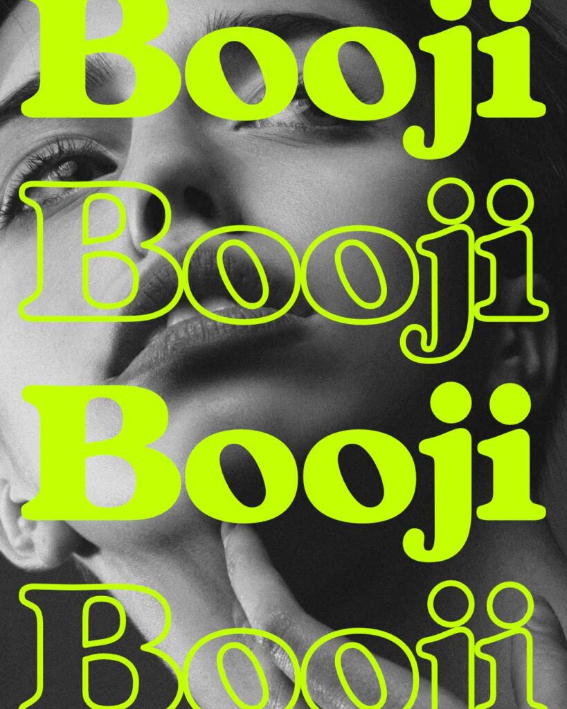
For Day 61, I used the Booji typeface. It’s a nice typeface I wanted to play around with.
For the background image, I chose a photo by Alexander Krivitskiy. I wanted something that would give the Booji typeface an elegant feel. Something you would see in the mall or on a billboard. I believe I achieved that.
There’s always room for improvement — always. But I’m happy with what I achieved.
Day 62
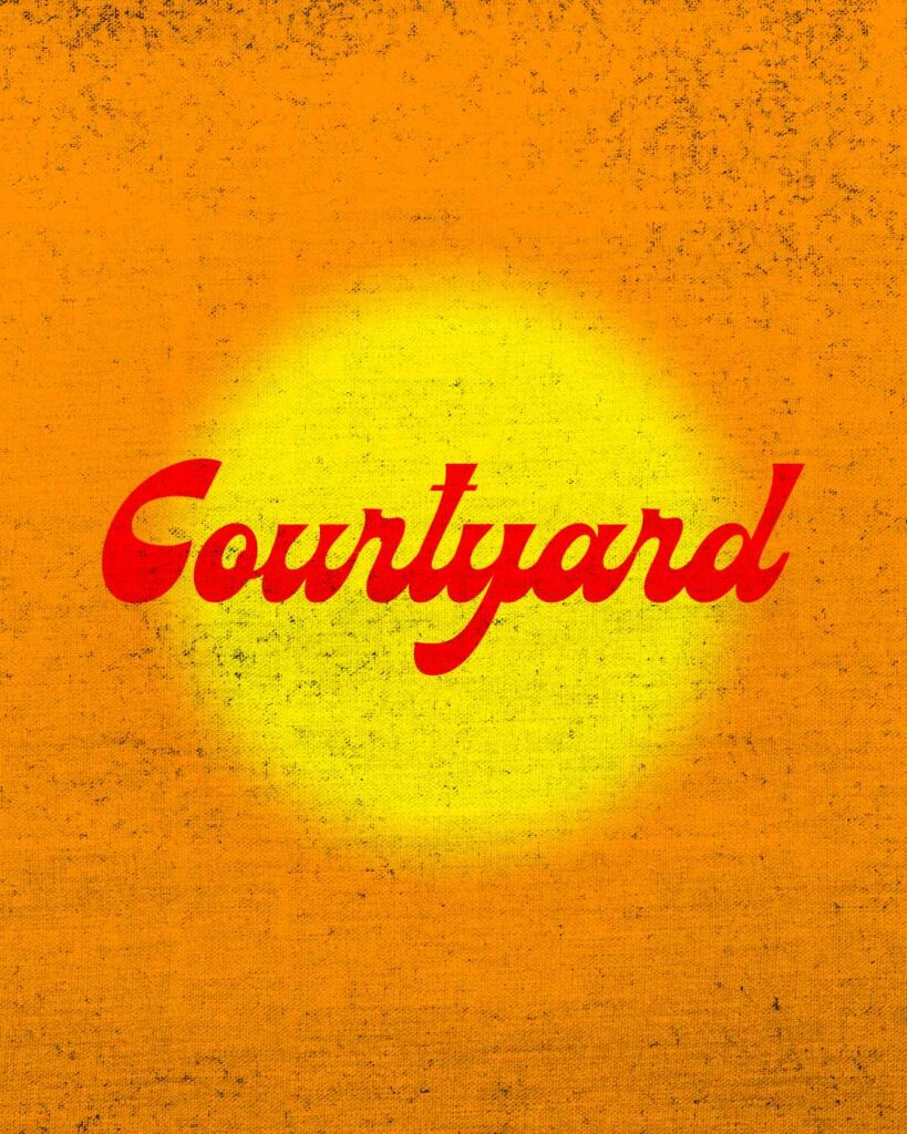
I started Day 62’s project with selecting the Courtyard typeface. The font reminded me of something you would see for a summer commercial or a “refreshing” brand.
I didn’t use any images this time around because I want to learn how to do design without images. That will be the challenge within the challenge for me.
Overall, I like the end result and I want to continue to make designs with no images. Just shapes and typography.
Day 63
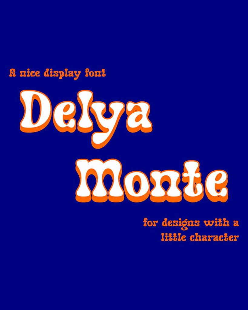
For Day 63, I challenged myself to just use type for the design.
I started with selecting the Delya Monte typeface and created a drop shadow to make the font pop. The goal is to show off the typeface. I believe I accomplished that.
Leave a Reply