
Designs for Week 05 of 2025 taking on the 100 Days of Graphic Design Challenge.
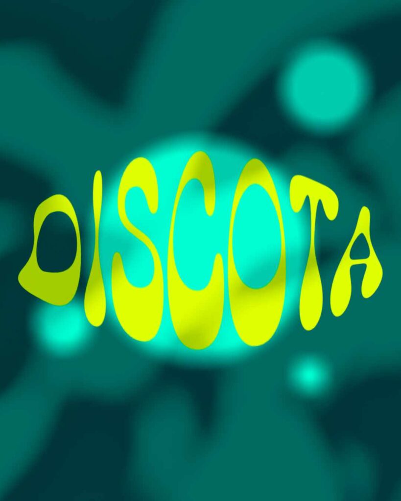
Day 64
For Day 64, I selected the typeface Discota.
I wanted to do something a little different and decided to transform the text a bit. Then, added some effects to the background to make the image pop. Overall, I liked what I did since I’m challenging myself to not use any extra images.
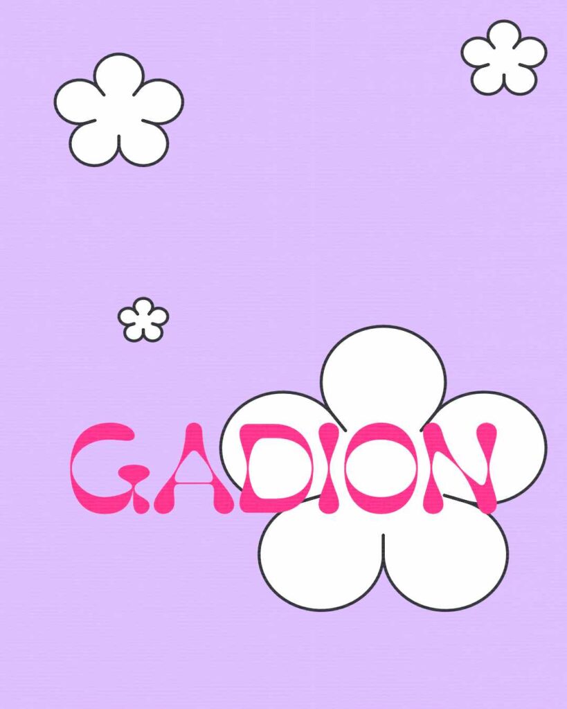
Day 65
For Day 65 I started with selecting the Gadion typeface.
Since it was another bold retro font, I wanted to continue to use 70s like images. I made simple flower shapes, and I’m happy with the result. I could have played around with the colors some more, but I’m happy with what I managed to get done.
There is always room for improvement. Always.
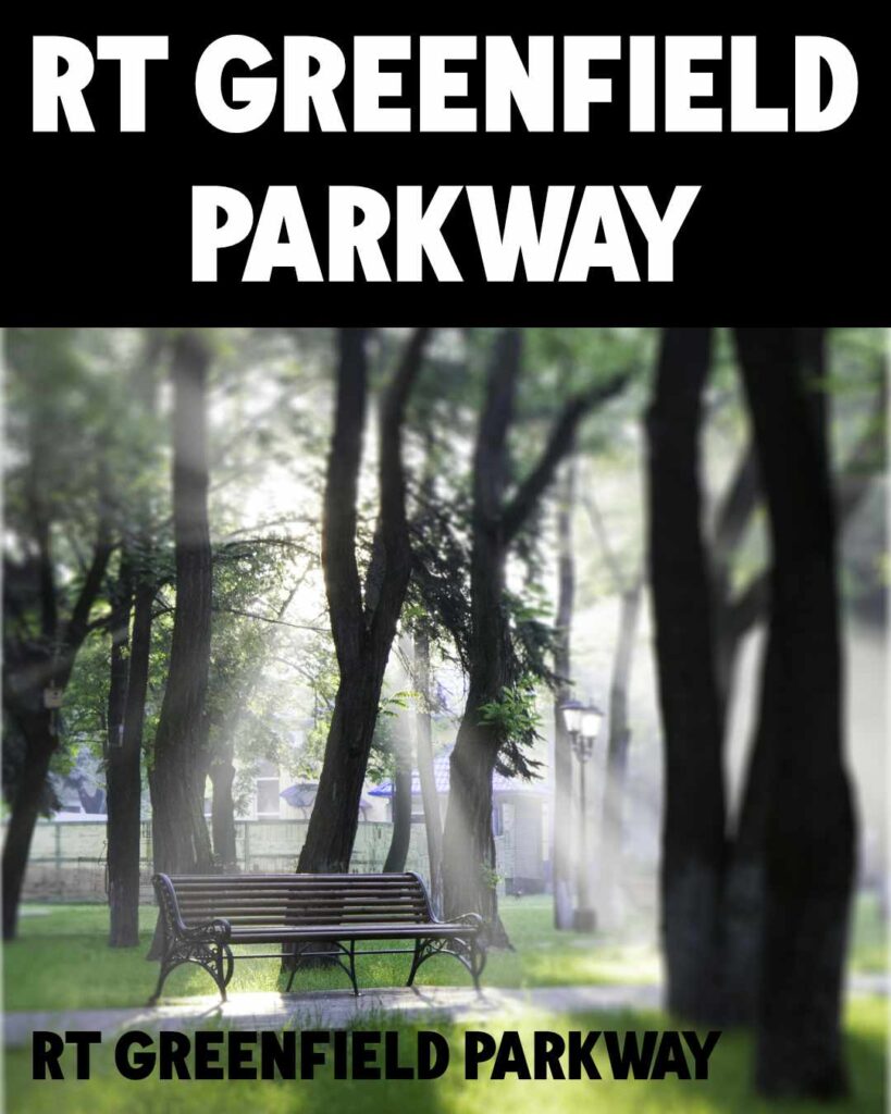
Day 66
For Day 66, I went back to using images.
When I selected the RT Greenfield Parkway Sans font, my immediate thought was using the image of a park (lol). So I wanted to make a park poster. A flyer you might see for an event at your park.
Maybe I should have added more text to really capture that feeling. That’s something to think about in the future. But I’m happy with what I managed to accomplish.
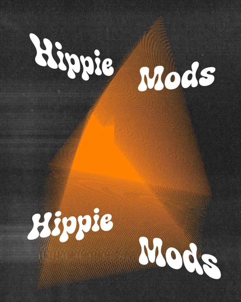
Day 67
For Day 67, I tried to do something a little different.
As always, I started with selecting a typeface. I chose another bold retro font called Hippie Mods. At first, I wanted to create some colors and shapes that would be reminiscent of the 70s. But then I thought, why not subvert expectations?
So I did something a little different.
I love the result. Adding a texture always gives a fun look to the overall image. Onward to Day 68.
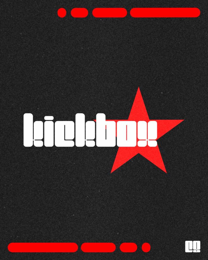
Day 68
For Day 68, I selected the Kickbox typeface.
I like the Kickbox typeface a lot. I can see a lot of utility with this typeface, especially when it comes to creating cool designs. I definitely want to use this typeface for future design projects.
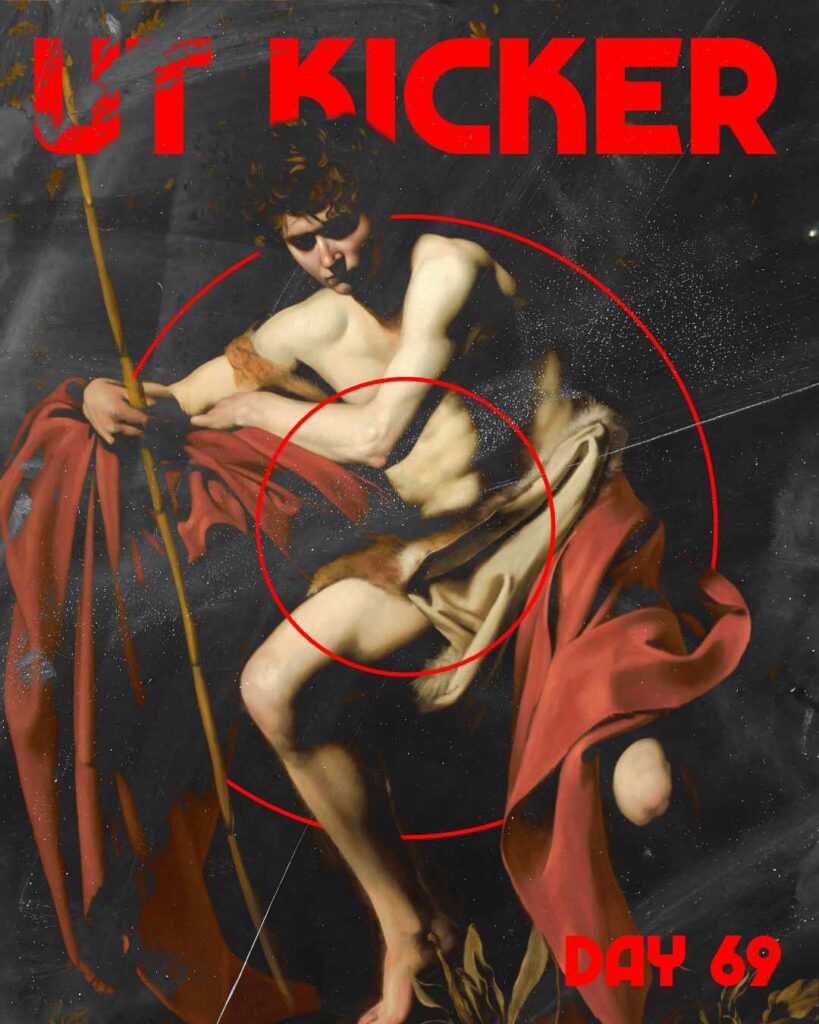
Day 69
For Day 69 I started with using Caravaggio’s Saint John the Baptist in the Wilderness (1604) as the main image.
The painting itself is a pretty painting, so I wanted to do something with it. I paired the UT Kicker typeface with the painting and then some elements to make the overall image look grungy.
I love the end results.
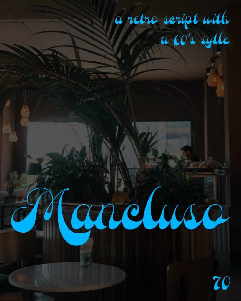
Day 70
For Day 70, I started on this project by selecting the typeface Mancluso. What I like about this typeface is that it is a retro script. It gives that old school diner type of feel.
So I wanted to pair the typeface with an image of a diner or restaurant. I selected a photo by Kübra to do just that. There is probably more that I could have done, but I’m happy with what I accomplished.
Leave a Reply