
Designs for Week 06 of 2025 taking on the 100 Days of Graphic Design Challenge.
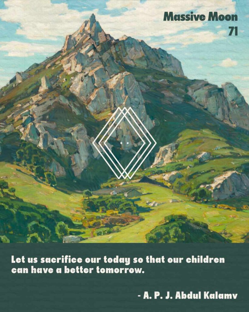
Day 71
I had a lot of fun working on today’s challenge.
I started off with selecting the Massive Moon typeface — a nice bold typeface that can fit in most designs. This is another typeface that I really liked working with. I thought it worked well with Where Nature’s God Hath Wrought (1925) by William Wendt.
I also added a quote, I think, is pertinent during this time.
This week is already starting off well.
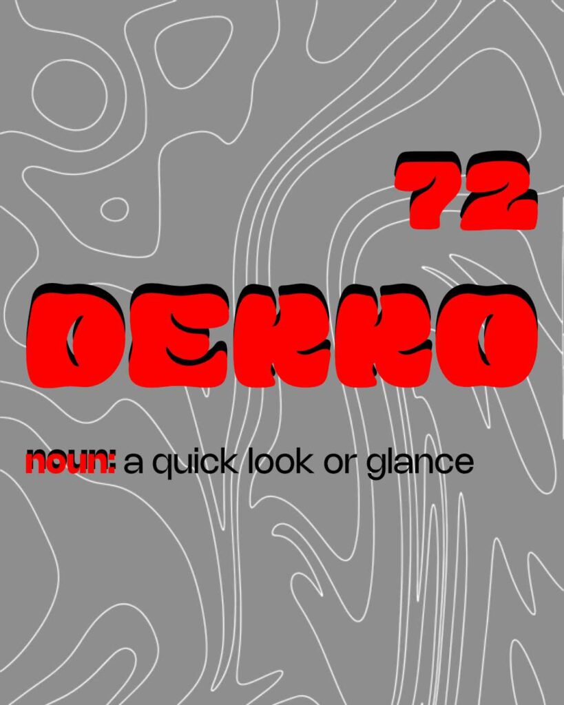
Day 72
Instead of just using the name of the typeface for the text, I decided to showcase a new word I learned about and it’s definition.
The typeface used for this project is called Mindflow. Another cool typeface from The Bold Retro Font Bundle that I had a lot of fun playing around with. I could have done a number of things with this typeface. But I like the end result.
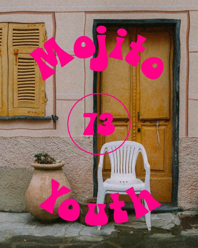
Day 73
I had a lot of fun with this one.
I started Day 73 with selecting the Mojito Youth typeface from The Bold Retro Font Bundle. Another fun typeface you can do a lot with, especially if you want to communicate a light, fun tone with your designs and images.
For the background image, I used a photo by Matteo Badini. I did some light edits — nothing serious. Just enough to draw the eye to the text in the design.
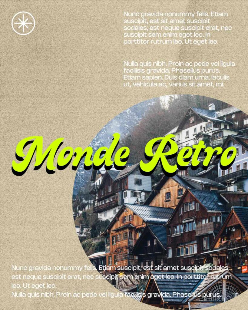
Day 74
Wow.
I nearly forgot to work on this piece due to work and school. But I managed to get something out. It’s not the best, but at least I got something done.
I started on this piece by selecting the Monde Retro typeface. Then, I used a photo by Riccardo from Pexels.
A bit of a rush job, but I’m okay with the piece as a whole.
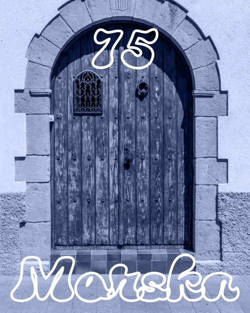
Day 75
Marska is the typeface I chose to use for Day 75.
I’ve been looking at photos of doors on Pexels, and I found one I wanted to do something with. There are a lot of cool looking pictures I can use for future projects. I might just do that for the 100 Days of Graphic Design challenge.
I also want to add more photo effects, so that is something that I am going to look into.
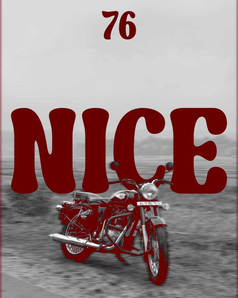
Day 76
As always, I started this project, selecting a typeface called Nice.
Like the past few typefaces I have used, the Nice typeface was a part of The Bold Retro Font Bundle. Another nice 😏 typeface I can see myself using in the future.
For the image, I used a photo by m s a to pair with the Nice typeface.
I wanted to play with colors a bit. Give the image a bit of an exposure feeling. In this instance, a dark red fit in well with what I wanted to accomplish.
I’m sure I could have done more.
In the future, I might come back to some of these projects to adjust and change some things.
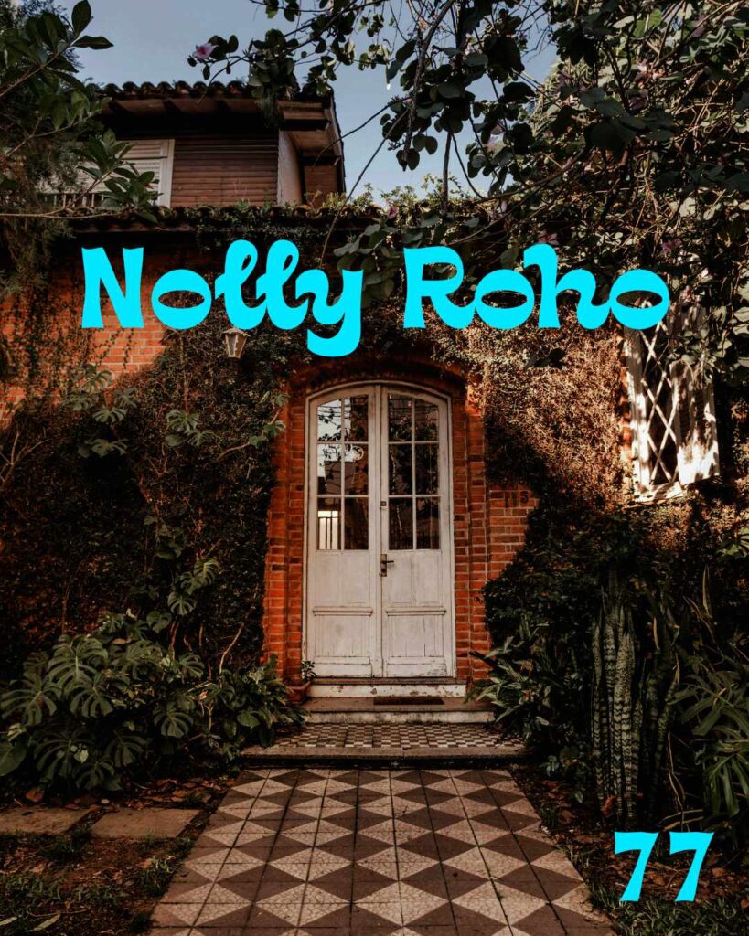
Day 77
The typeface I used to Day 77 is the Nolly Roho typeface that I got from The Bold Retro Font Bundle.
I wanted to pair the typeface with a door photo by Jonathan Borba. I just made the photo a little darker so the typeface became more visible. I wanted to do more but I felt that would make the image too cluttered.
Another successful day.
Leave a Reply