
Designs for Week 09 of 2025 taking on the 100 Days of Graphic Design Challenge.
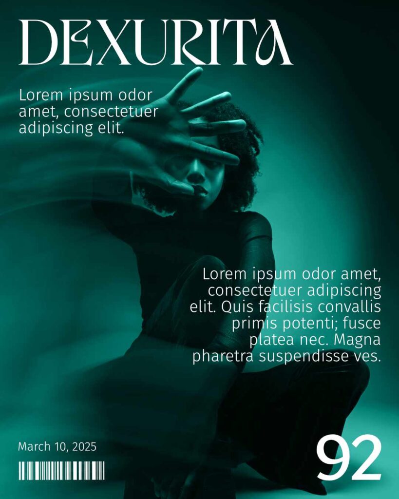
Day 92
I started with selecting the Dexurita typeface.
I wanted to then make a magazine-like cover, and hunted for an image that, I thought, would fit the Dexurita typeface to achieve that. On Unsplash, I picked a photo by Jay Soundo I thought fit well.
Overall, I like the piece. Could I have done more? Always. But constraints keep me focused and not navel-gazing.
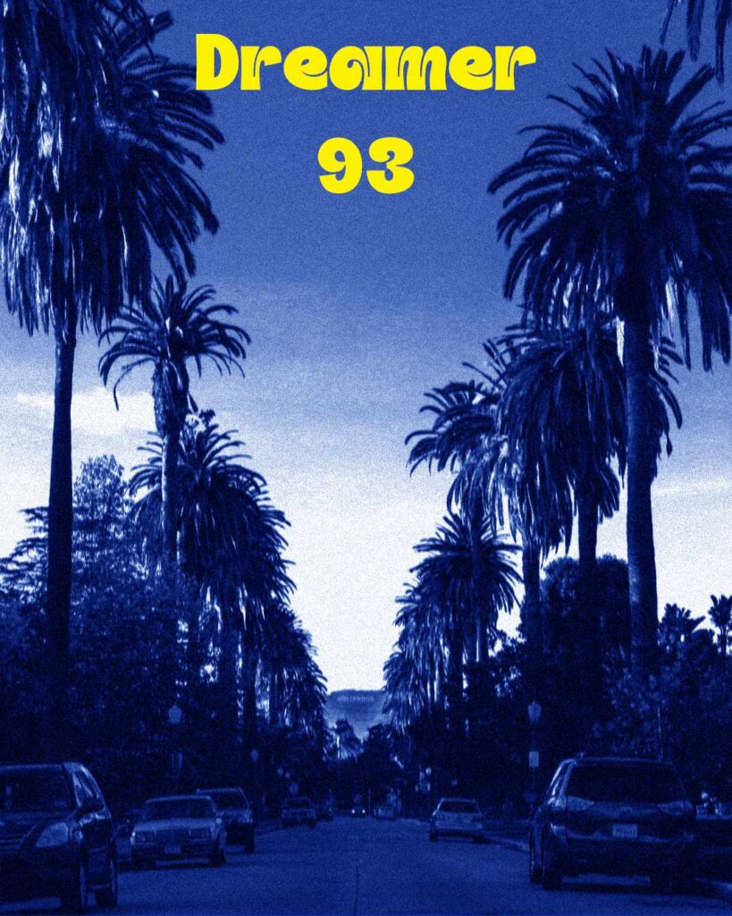
Day 93
I started with selecting the Dreamer typeface from The Dynamic Display Font Bundle from PixelSurplus.
Since the typeface does, well, have a dreamy feel to it, I wanted to pair the typeface with an image that could replicate that feeling. Or, at least, amplify. So I used a photo by Steven Pahel on Unsplash of a street in LA. However, I wanted to give the photo a grainy feel and add a cool color.
I like the result.
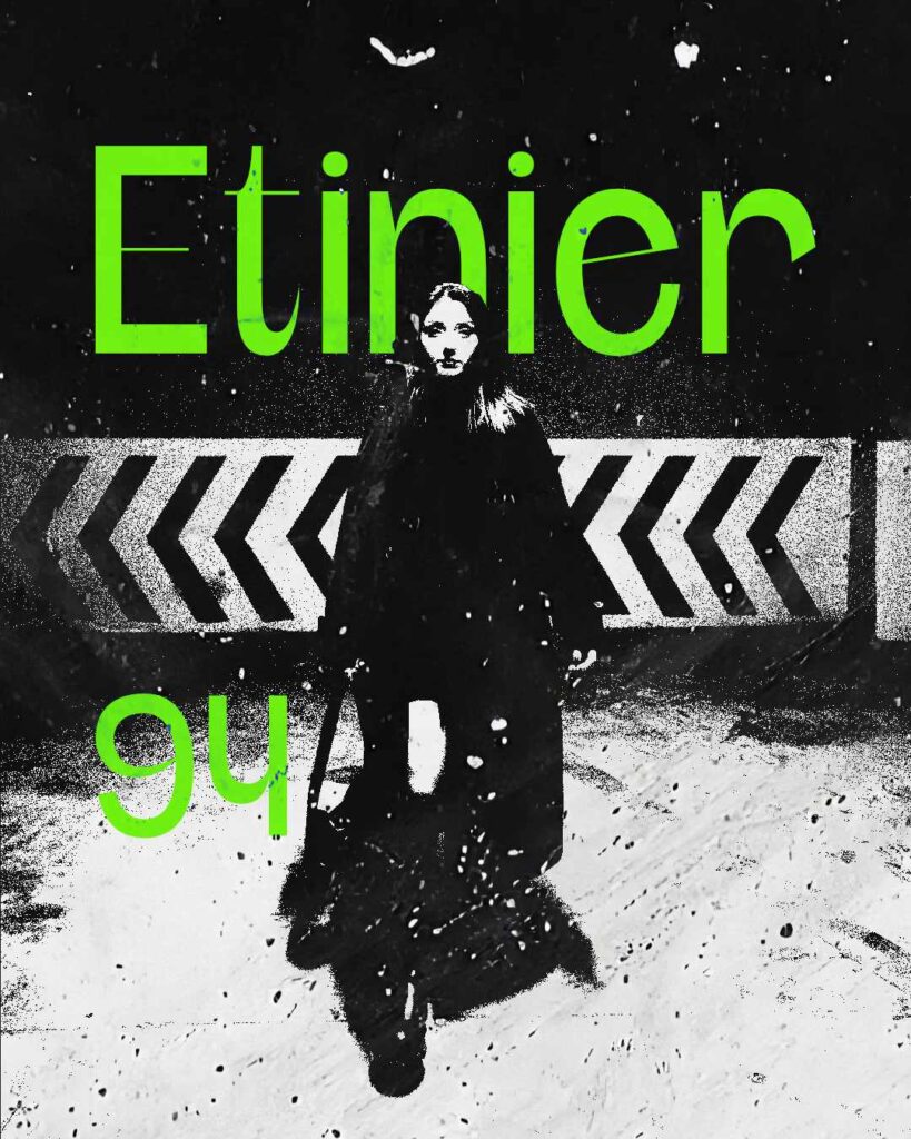
Day 94
Since I’m new to Affinity Photo 2 and still trying to figure the nooks and crannies of this program, I looked up some tutorials on how to use textures, etc.
Most features you use in Photoshop can be directly translated to Affinity Photo 2. But since Affinity is a much younger program than Photoshop, there are some features missing. I never got too deep in the weeds of Photoshop, so there is no unlearning I need on my part.
Anyway, I say all of this because I used this tutorial by bitmancer to see what I can do. I messed around with a few things and then selected the Etnier typeface from The Dynamic Display Font Bundle from PixelSurplus.
I had a lot of fun trying to figure this one out. Photo by İsmail Güngör Gedik on Unsplash.
Day 95
I wanted to do another project that has another gritty feeling to it like I did for Day 94.
I started with selecting a card photo from Pexels by Pixabay. I wanted something that could give the project a grungy feel. Then, I selected the FT Feliux typeface from The Dynamic Display Font Bundle from PixelSurplus to pair with the image.
Red is one of my favorite colors to work with (you can see it in my past projects), so I decided to use that along with some textures to add some noise and scratches.


Day 96
For today’s design, I started with selecting the Jt Modernism typeface from The Dynamic Display Font Bundle from PixelSurplus.
Because the typeface has a bit of whimsy to it, I wanted to still use a brutalist-style while making sure the typeface didn’t seem too out of place. I really love using thresholds and noise to add something to an image.
So I selected a photo of a restaurant from Lisa from Pixels. I wanted to play with shapes a bit, but I felt that made the image look a bit cluttered. I decided to keep what I have.
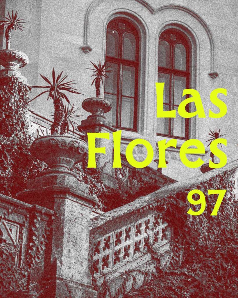
Day 97
For this project, I started with selecting the Las Flores typeface from The Dynamic Display Font Bundle from PixelSurplus.
Then, I selected an architectural photo from David Bartus. I really like the photo and thought it would pair well with the Las Flores typeface. Then, I turned the photo black and white and added some noise. The fill layer in Affinity Photo 2 makes creating color layers easy, and I did that for this project.
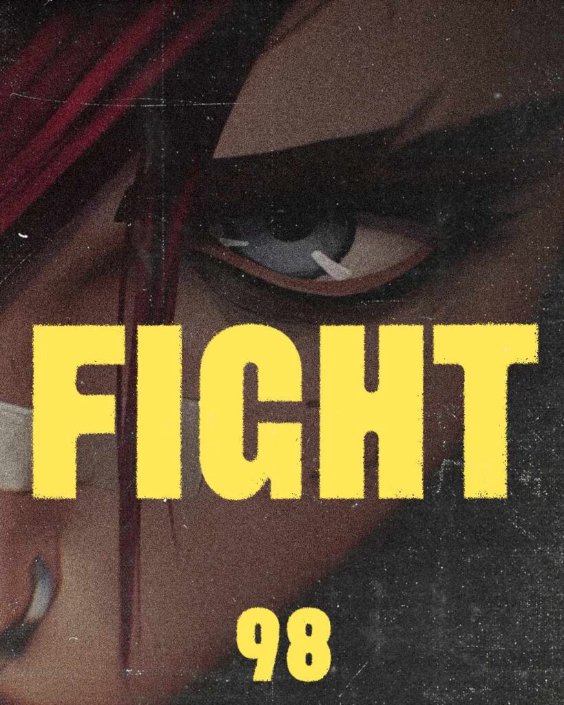
Day 98
This design started with selecting the Quipo typeface from The Dynamic Display Font Bundle from PixelSurplus.
I wanted to do something a little different today, so I decided to use an image from one of my favorite shows, Arcane. I wanted to create a grungy feel to the image and change up the text I’ve been using so far.
The reason I used the typeface name as text is because it made designs easier in the timeframe I allotted for myself.
Leave a Reply